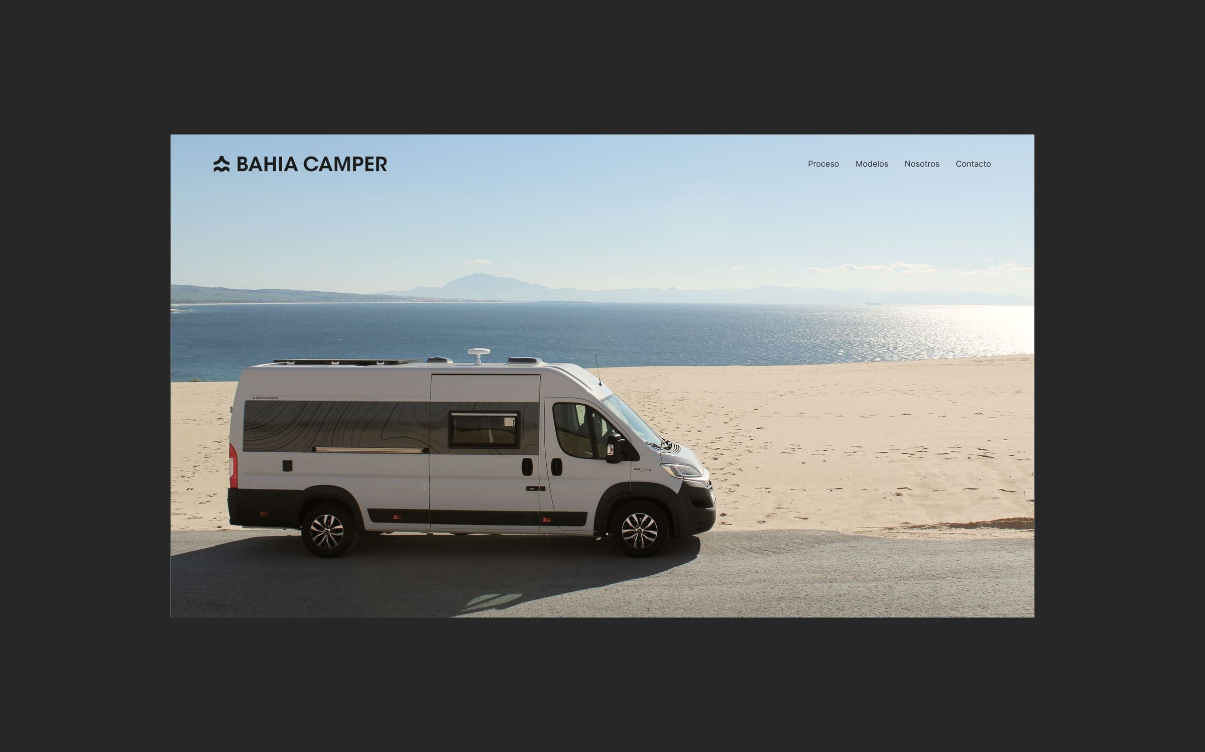
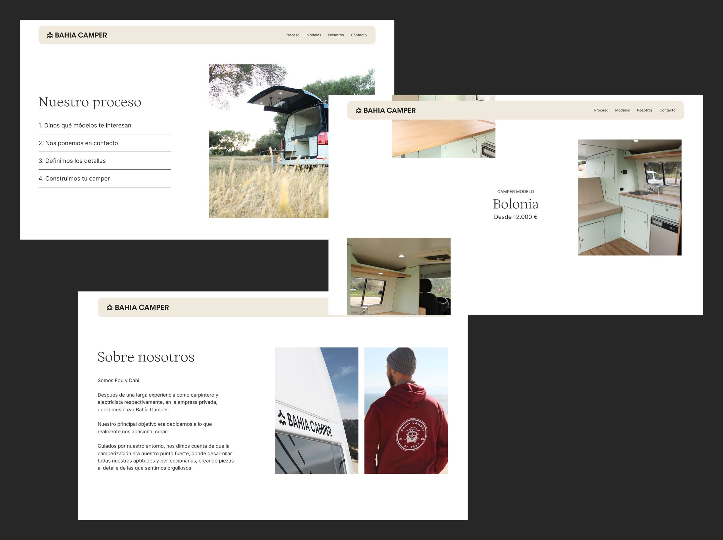
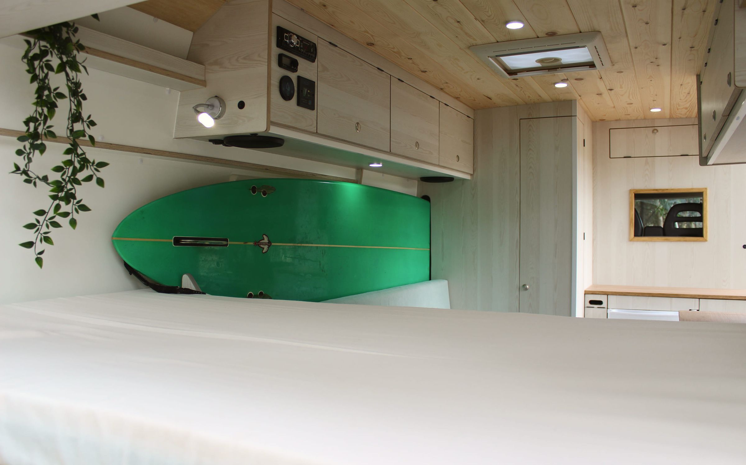
A camper conversion workshop based in the south of Spain. The branding draws from the coastal landscape of the area: earthy tones, clean shapes, a no-frills aesthetic that reflects the craft behind each build. The website follows the same logic: simple, visual, and easy to navigate.


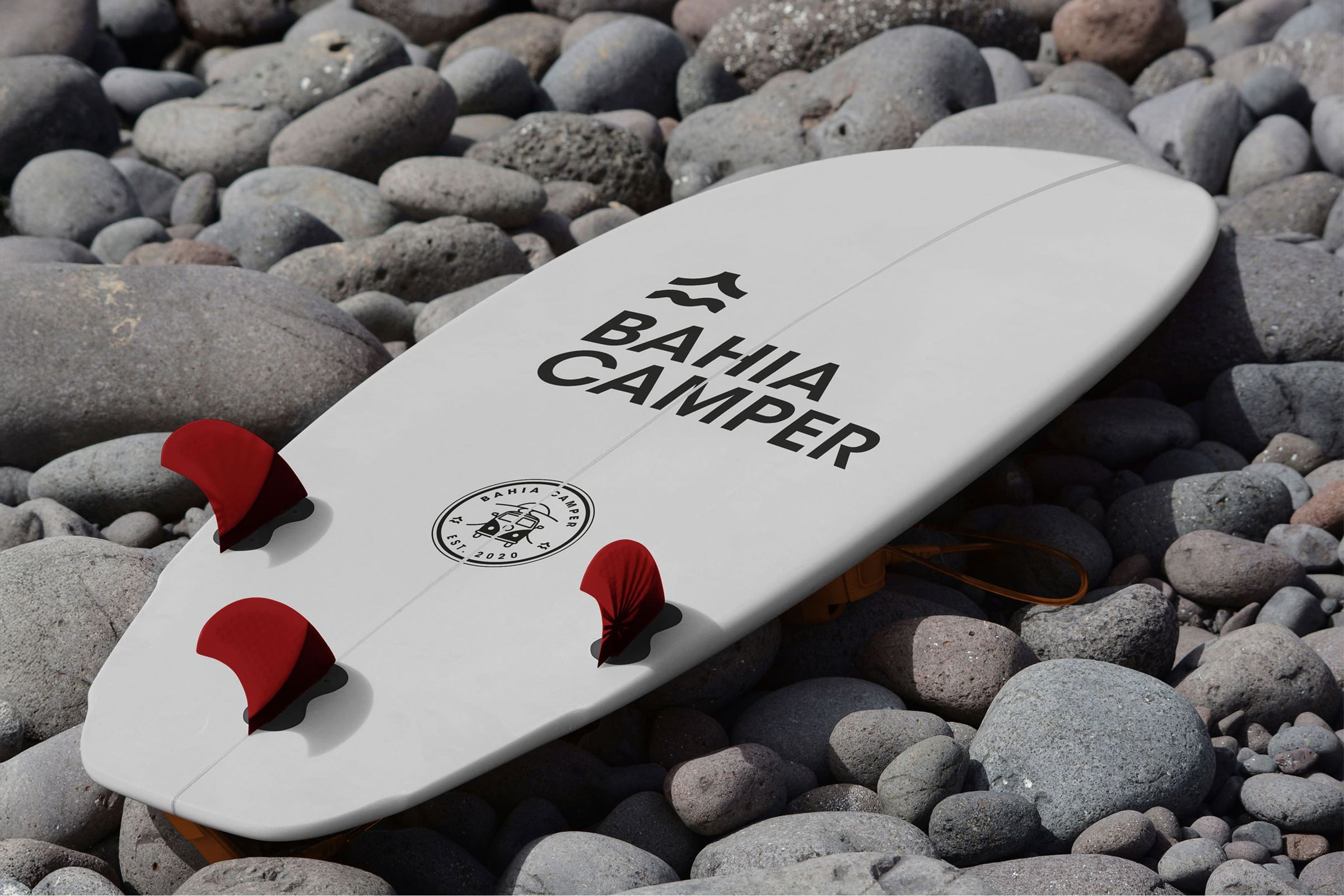
The identity is built around a single mark: a mountain meeting a wave, a nod to the landscape these vans are built to explore. It works two ways: a clean, modern symbol for digital and signage, and a stamped est. 2020 badge that nods to the workshop craft behind every build. Monochrome throughout, so it holds up printed on an enamel mug or stitched onto a hoodie.
Ortica Light brings an editorial, almost handmade warmth to the headlines, while Inter keeps the everyday text plain and legible. Two voices, one idea: something made by hand, explained without fuss.





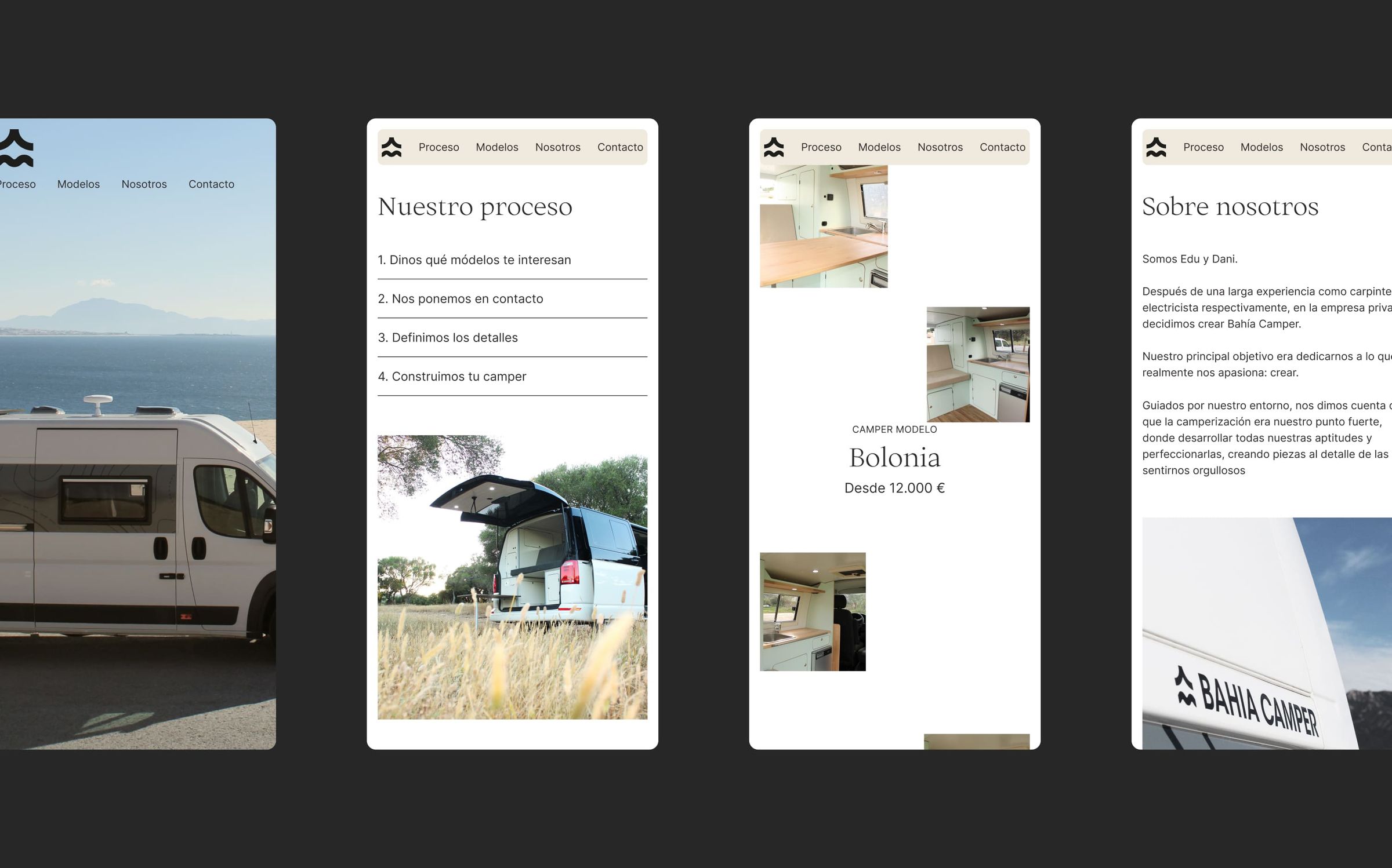
The website is built to do one job well: show the work and make it easy to start a build. A clear four-step process. Models laid out with honest pricing. Designed and developed to feel calm and tactile, and to work just as well on a phone parked at a clifftop as on a laptop at home.