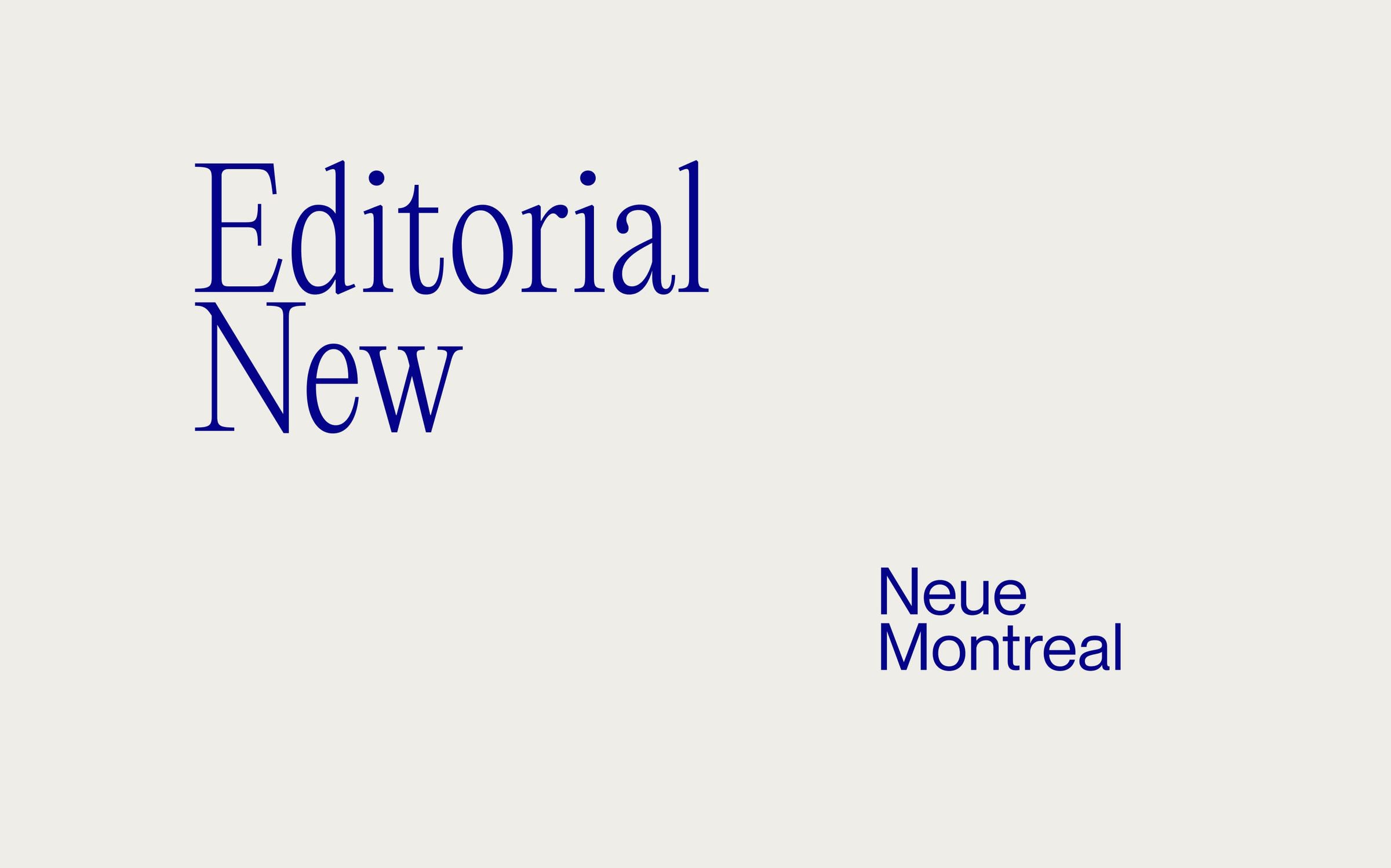
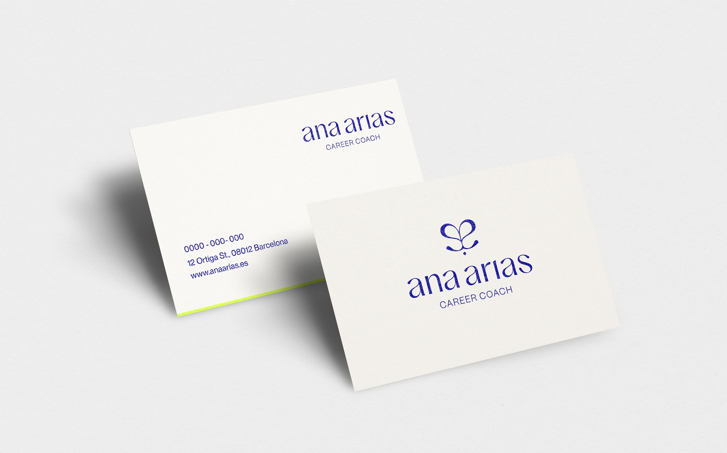
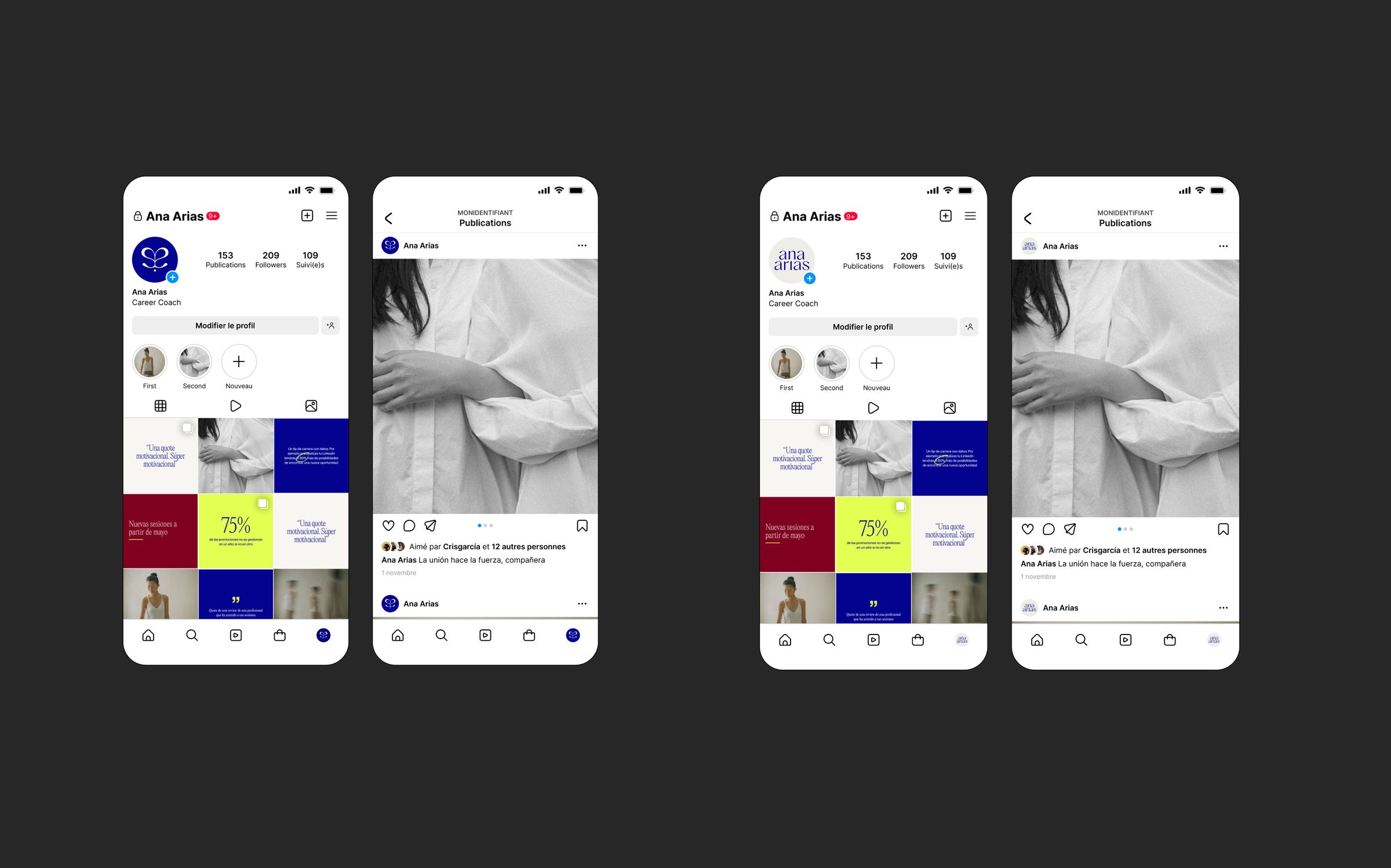
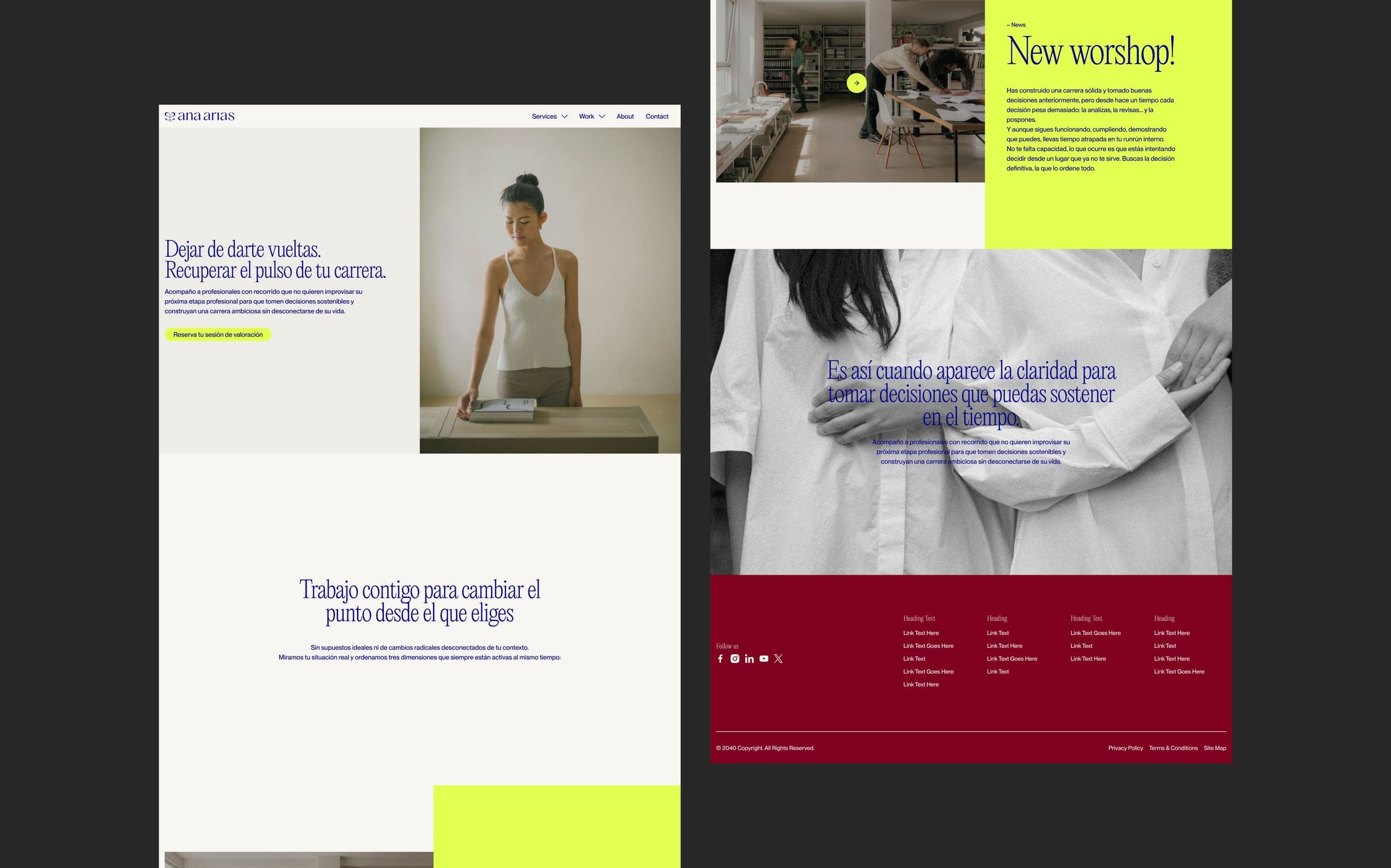
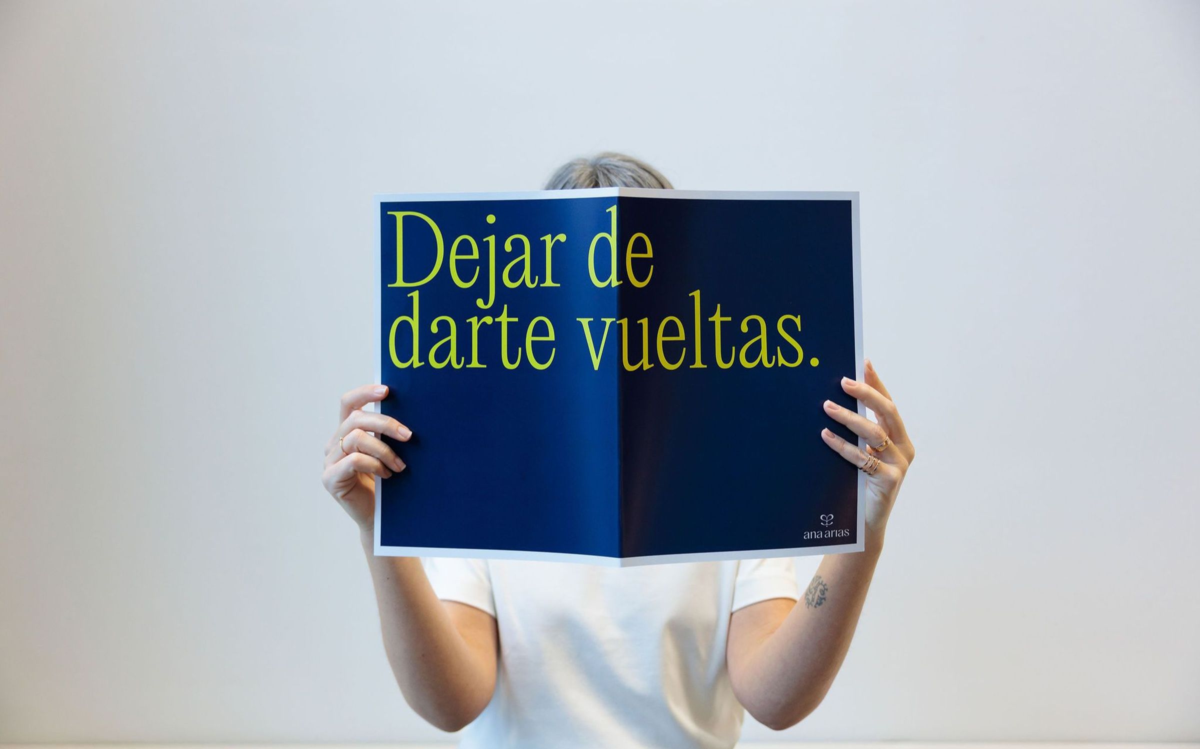
Ana Arias is a career coach who partners with companies investing in their people, and works one to one with professionals ready to turn their situation around. She wanted a brand as clear and assured as her coaching. This meant a new logo, colour palette, typography and art direction to match.


Her work sits between two worlds: the structure of the workplace and the very personal moment of rethinking a career. The identity had to hold both; professional enough for the companies she partners with, human enough for the person sitting across the table.


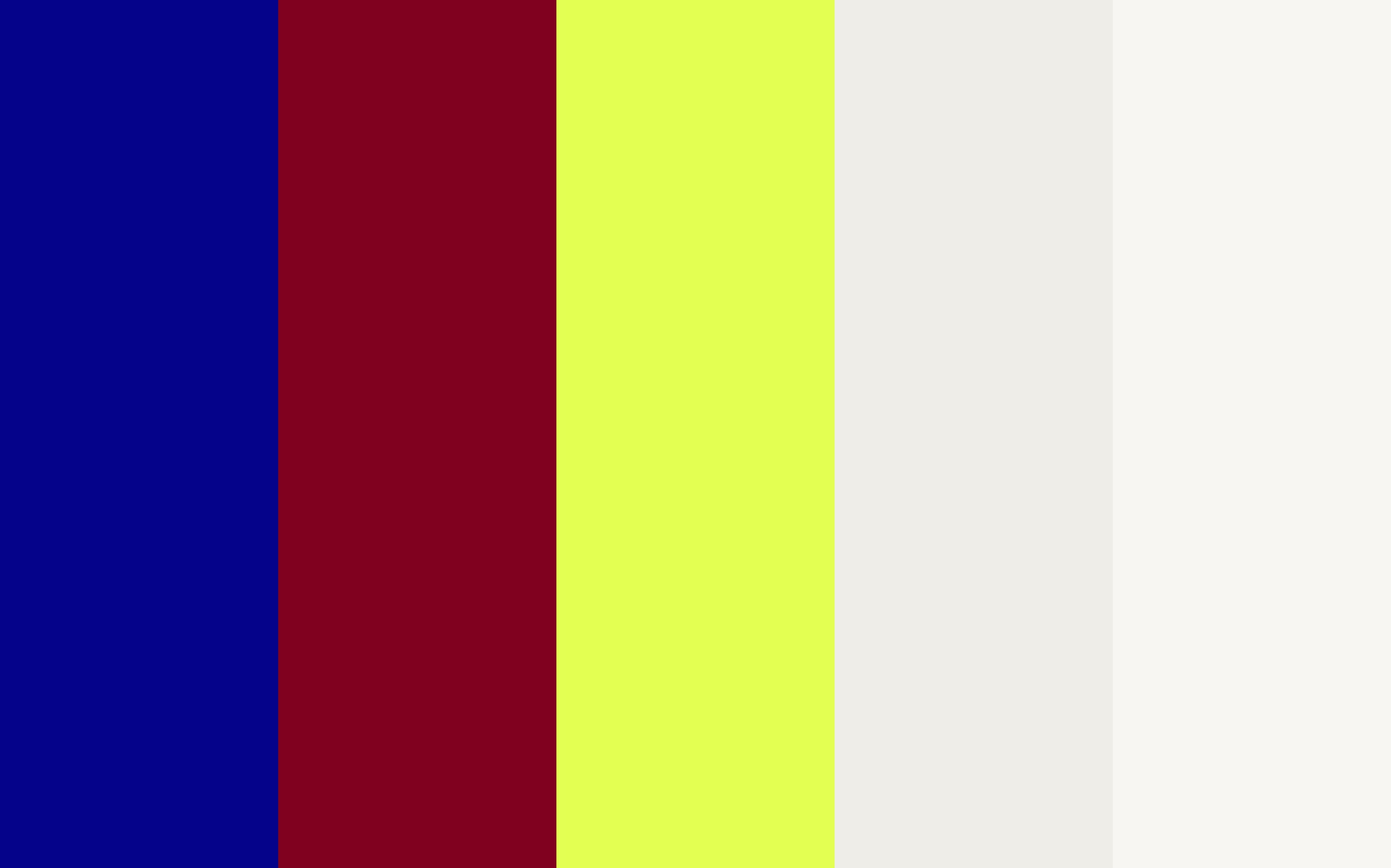
The new identity moves the way her clients do once they find their footing. A confident wordmark anchors a palette where cobalt and a deep red speak to the professional world Ana works within, while an acid yellow marks the change her clients are reaching for. Paired with a clean typographic system, it carries one idea throughout: focus and flow, the rhythm Ana helps people get back.